Elevating Dermalogica's Global eCommerce Experience
Since its acquisition, Dermalogica's focus has shifted to direct-to-consumer efforts. It sells in national accounts like Sephora and Ulta, creates global social media campaigns, and supports custom B2C technology like Face Mapping. All these efforts ultimately link to our eCommerce experience, and yet this is the one touchpoint that does not feel elevated or in line with our new brand codes. I set out to remedy this.


Dermalogica gray is emphasized across the designs, as seen in this optional quiz flow that was created for users who didn’t consent to image capture.
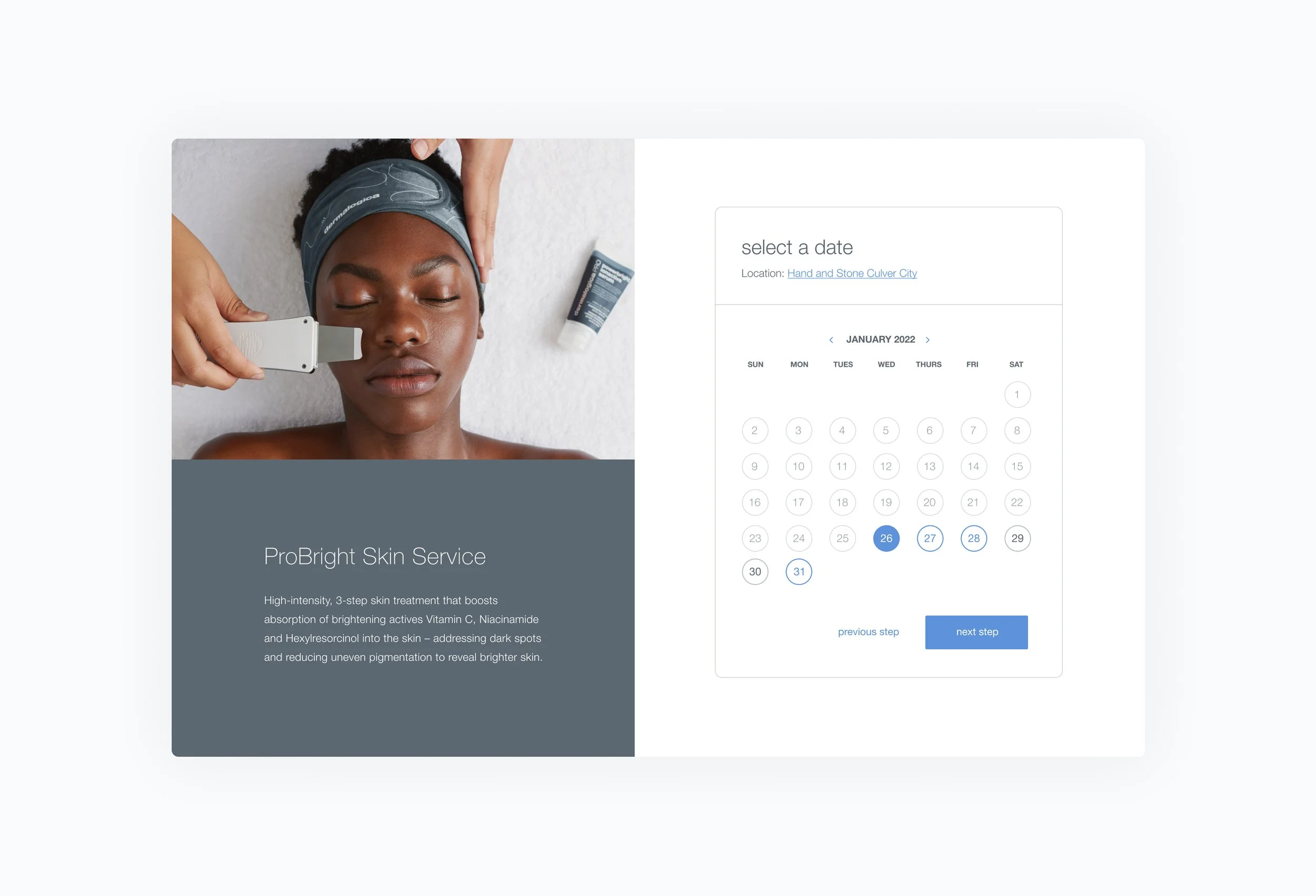
Users are able to book a recommended treatment immediately.
All content is personalized based on the user’s top skin concerns, including product recommendations, key ingredients to look out for, and blog posts.
Problem
Definition
Competitive
Analysis
Diverge and
Design
Converge
and Refine
Conduct
UX Audit
Start with what you know
After months of convincing, Dermalogica gave me the green light to redesign its global eCommerce experience. I was thrilled and humbled by the blank canvas in front of me. I created a loose project outline to structure my thinking and started collecting readily available information. How could I know where to go if I didn't understand where we were?
Notable Features
A single Face Mapping analysis can be completed in 7 clicks, but this product is mighty. It’s an experience that feels seamless and frictionless for consumers while powering entire data, media, and CRM strategies. The opportunities to leverage this data are endless, but so are the guardrails and considerations. Below are a handful of notable features and revisions we’ve made:
Translations + Cultural Nuances
Face Mapping is translated into 30+ languages for our global markets
-
I work on a global team whose work cascades across 80+ markets and subsidiaries. While the nature of this work is exciting, it does present real and complicated guardrails from a design perspective. We translate everything we do, so we can’t rely too heavily on text in our designs. Additionally, we must keep a continuous pulse on any cultural and technical nuances that might warrant changes in imagery, copy, and tone.
Modularized Codebase
We restructured the codebase to test design variations in real-time.
-
When Face Mapping averaged one million unique image submissions annually, we knew we had proven product viability. While reaching this milestone was rewarding, we recognized that there was still a lot of work to be done. After conducting a thorough retrospective, it was clear that we needed to clean and restructure the codebase.
While our developers removed legacy code, improved page load times, and reworked integrations, I created several designs for each page in the user flow. Now we can A/B test entire pages at the user level in real-time. Which 'results page' leads to higher conversions, a single product recommendation, or a complete six-step regimen?
These are the hypotheses we can create and test now.
Pointing to the Skin Expert
Face Mapping is a direct-to-consumer product, but we didn’t forget about our professional skin therapists and their business goals.
-
When Unilever acquired Dermalogica in 2008, the company's focus shifted to eCommerce and direct-to-consumer initiatives, including launching in Ulta and Sephora.
While this change was necessary, we have always remembered the professional skin expert. Everyone who completes Face Mapping will receive a service recommendation, driving our B2B2C business. Additionally, we designed a treatment booking system so users can book a treatment with a local skin expert directly in Face Mapping – it's like Open Table for skin treatments.
Embed v.s. Microsite
Face Mapping is an embeddable microsite that can be woven into every aspect of the consumer buying journey, including eCommerce.
-
We direct traffic from social media or advertising campaigns to a dedicated Face Mapping microsite and embed the widget in all Dermalogica eCommerce experiences. This duality presents a handful of exciting design considerations:
Navigation – you can't include horizontal navigation because that would compete with the main navigation of the host website.
Structure and spacing – important information exists within a narrow, central portion of the screen so that it responds cleanly across browser and device sizes.
Colors and contrast – you cannot use white as a background color, or it blends into the host site unsettlingly.
Performance
Face Mapping’s constant evolution has directly impacted business growth, conversion, and overall customer satisfaction. We are incredibly proud of these wins.
-
![]()
1 Million+ Unique Visitors Each Year
Over one million unique users turn to Face Mapping for clarity and guidance throughout their eCommerce journey.
-
![]()
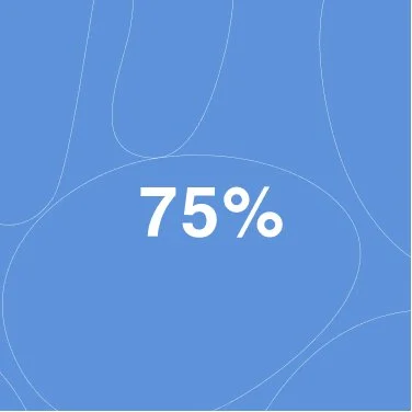
75% Conversion, 25% AOV
Customers who complete Face Mapping convert about 75% higher and have an increased AOV of about 25%.
-
![]()
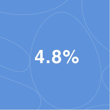
We Beat Traditional eComm
The mobile version of Face Mapping out-competes our traditional eCommerce conversion rates by roughly 4.8%


thank you
As always, a project on this scale can only be brought to life with the help of an incredible team. I want to use this space to thank Robert Achilier (Lead Front-End Developer), Ashley Coty (Operations), and Even Willenson (Data Strategy).
A special thank you to Frank Freeman (VP Digital Disruption) for giving me full autonomy and creative freedom – your an unwavering trust and belief in me from intern to manager has given me the confidence to create, push and pull, and grow in ways I never imagined possible.