Dermalogica Portal
Dermalogica Portal is an internal tool used by the B2B2C salesforce to manage accounts, track sales, and facilitate conversation.
Background
Dermalogica's CEO, Aurelian Lis, and my supervisor routinely task me with vague and open-ended assignments that typically involve researching and presenting viable solutions to business problems. Dermalogica Portal is the product of one task – understanding and closing the gaps in information transfer from Dermalogica HQ and our salesforce.
-
· Lead UX Researcher
· Product Strategy -
3-week research sprint. 1 month build + QA.
The Challenge
How might we empower Dermalogica's salesforce with real-time account data so that they can better manage and track account progress?
-
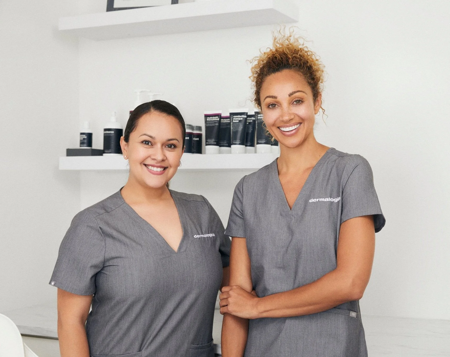
Dermalogica is both a B2B2C and B2C company. Our B2B2C business is a highly complex network of National Accounts like Ulta and Sephora and small businesses. These business accounts are organized by district and managed by business consultants.
Business consultants act as Dermalogica representatives and work closely with accounts to ensure they are successful. They place large product orders, help skin therapists access the latest training, and provide tips for in-store merchandising.
The challenge is to give these Business Consultants access to real-time account data so that they can truly understand how their accounts are performing. Waiting for this information to trickle down to them via a weekly email can be frustrating and hinder their ability to make strategic data-driven decisions.
The Solution: Dermalogica Portal
Dermalogica Portal provides real-time account analytics in a streamlined dashboard view. It is designed specifically for iPads, as each business consultant is issued a company tablet. We transformed complicated datasets into simple visualizations to facilitate clear conversations with non-technical audiences.
Research Outline
I needed to understand how business consultants managed their accounts, so I planned a thorough qualitative and observational research sprint. After conducting ten user interviews, an in-depth stakeholder analysis, and field research, I refined the problem statement and explored possible solutions. Documentation was a vital part of this process as I worked with peers who were not familiar with the design thinking process – having a framework, artifacts, and quotes to point to help facilitate conversation and validate the direction I took.
Qualitative Research: User Interviews
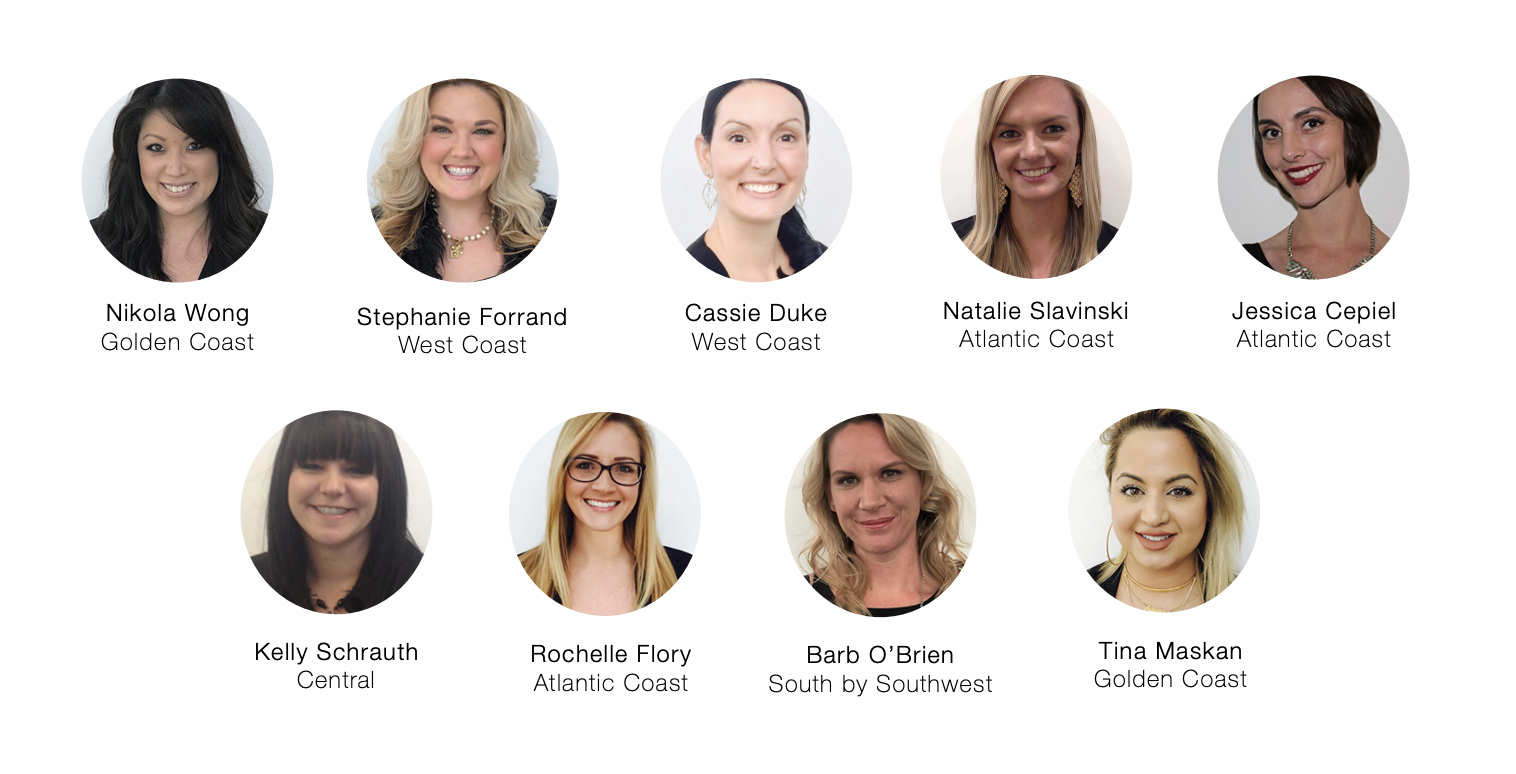
I scheduled one-on-one interviews with 9 Business Consultants from around the country to get a better understanding of what their job entailed. Discussions were an hour long, and we compensated each respondent for their time.
Respondents were thrilled to talk with me and appreciated Dermalogica creating a safe space to share their experiences. While I prepared a Moderator's Guide and Test Script, I found conversation flowed easily and provided a wealth of insight. I made a point to document everything they shared with me, even if it didn't pertain to the project's scope.
Listening and being open-minded helped me refine the problem statement. While Business Consultants needed access to real-time account data, several additional pain points in their day-to-day workflow would affect this project's success if we did not address them.
Quantitative Research
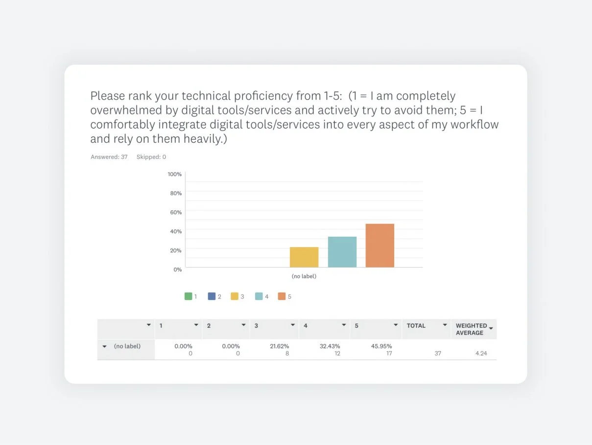
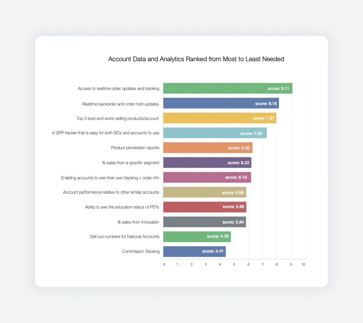
After conducting the interviews, I synthesized my notes and consolidated everything into patterns, key themes, quotes, and a handful of visual artifacts. I used this information to create a survey I would distribute to all 52 Business Consultants in the U.S.
The point was to quantify patterns and themes brought up in interviews, gauge overall technical proficiency, and use the opportunity to clarify anything. Here are a few results from that survey:
Why ask about technical proficiency?
I needed to know how complex the design should be.
Why ask respondents to rank which datasets are most important?
I knew this would be a big project and wanted to prioritize the most important features in the first build.
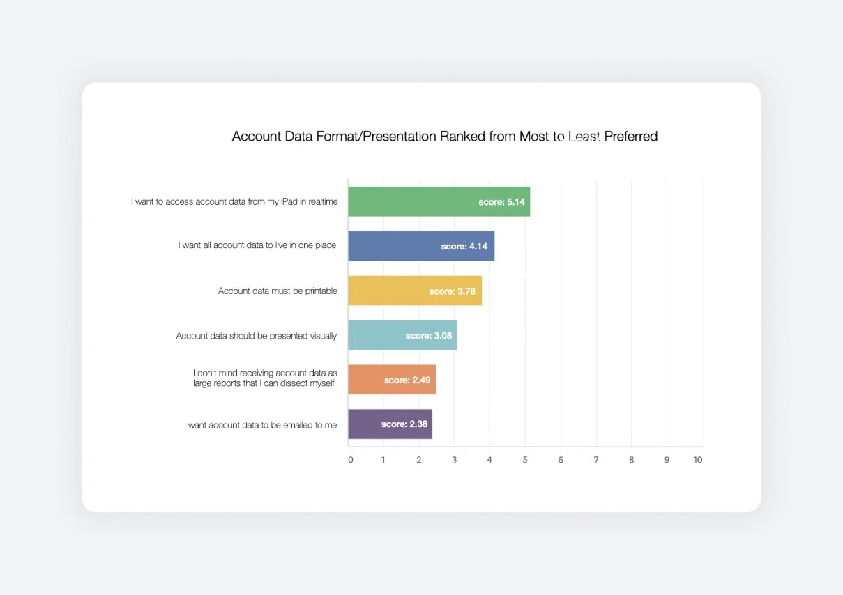
Why ask about medium?
Having great data means nothing if it’s not presented in the ways people want and need.
Research Synthesis
After concluding my research, I created a shareable deck that outlined my process (download link above) and several UX artifacts. These were integral in presenting my findings and validating my conclusions in conversations with stakeholders.
I could point to specific pain points in the user journey and reference real numbers from the survey. Suddenly the solution had a context; stakeholders who weren’t Business Consultants could empathize with their needs. The answers became a lot clearer.
Prototyping + Testing
Once I presented my research findings to stakeholders, I was connected with members of the Finance and Sales teams to help bring the first version of this dashboard to life. At this point, the bulk of the decision-making and configuration was in their hands as they lived and breathed this account data, but I remained on standby to assist.
When they had configured everything in Microsoft Power BI, I worked with them to design an on-brand and intuitive dashboard. We tested one version (below) with the Business Consultants and learned that we needed to simplify the interface even more.
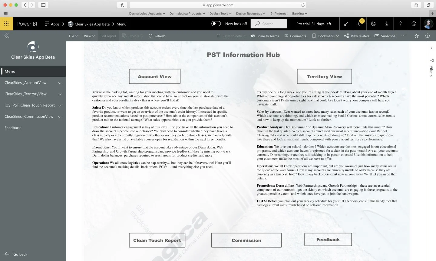
BEFORE: Sales and Finance sent me the Beta version of Dermalogica Portal and asked for design assistance on core pages, including this landing. As you can see, there are many competing CTAs and too much text. This design did not perform well with Business Consultants in usability tests.
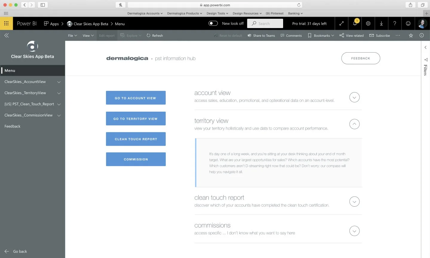
AFTER: I focused the CTA buttons into a pseudo-vertical menu, introduced an accordion to organize the overwhelming volume of text on the screen, and introduced Dermalogica brand colors and typography so that if a Business Consultant screen-grabbed and shared this page, it would feel ‘professional.’
BEFORE: This was the first version of the dashboard I created. It included all the correct information, but Business Consultants requested a simplified UI. They needed to be able to share this iPad view with business owners and skin experts and worried it would be too complicated.
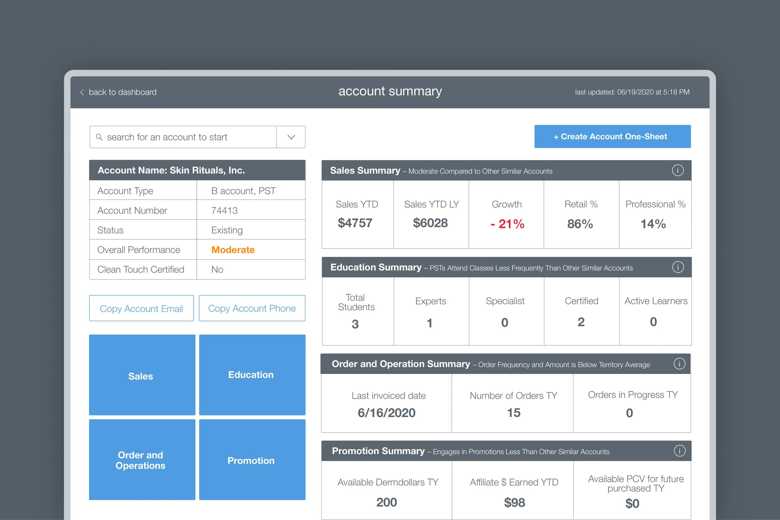
AFTER: This was the finalized UI direction for Dermalogica Portal. Bold numbers, "more information" tabs available everywhere, big buttons aligned with tablet devices' ergonomics, and a much clearer navigation and information hierarchy.

Conclusion
We want to empower business consultants to access sales, product, commissions, and forecasting analytics that can be broken down by both an account and territory level, all from one location/platform on their iPads. The portal should use simple visualizations and UI to make locating and sharing information easy. A notable portion of Business Consultants also wanted detailed reports that they could extrapolate.
Business Consultants should be able to customize and create an 'account analysis one-pager that will support the things they want to discuss in their meetings. This one-pager should be branded, preview well on an iPad, and be printable. All data should update in real-time and be accessible by all Business Consultants without needing to go through their District Managers. This solution should also be web-based to keep in line with the company's vision for a single sign-on, all-access hub.